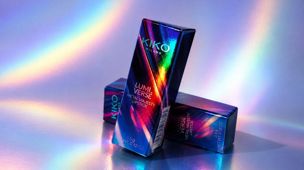


Can light become a design element? APG developed the packaging for the KIKO Lumiverse collection, demonstrating how materials, print and embellishments can turn light into an essential component. The surface of the boxes reacts to light, creating iridescent reflections that shift in intensity and colour depending on the point of view, giving each box a dynamic and distinctive character.
The secret to this effect lies in the choice of single-coated virgin fibre board — which has a high degree of whiteness and gloss — and the use of rainbow holographic lamination, obtained by applying a silver foil across the entire surface of the box. The luminous base breaks light into prismatic reflections, creating a shifting, iridescent effect that enhances the packaging as a whole.
Printing on this kind of surface requires extremely high precision, which allowed us to integrate four-colour offset printing over a Pantone base seamlessly with the holographic effect without compromising its brilliance or colour rendering. Every graphic element, from typefaces to gradients, is perfectly calibrated to ensure sharpness and legibility, letting light animate the surface.
A gloss UV varnish completes the packaging, providing visual continuity across the whole product and enhancing the dialogue between print and finishing, resulting in a clean, cohesive finish.
The project developed for KIKO Milano’s Lumiverse collection reflects APG’s design philosophy: creating unique packaging solutions in which technical expertise, aesthetic research, and quality of execution come together to interpret and represent the identity of each brand.
Read also: Minimalism is not flat, discover Iceberg’s packaging design