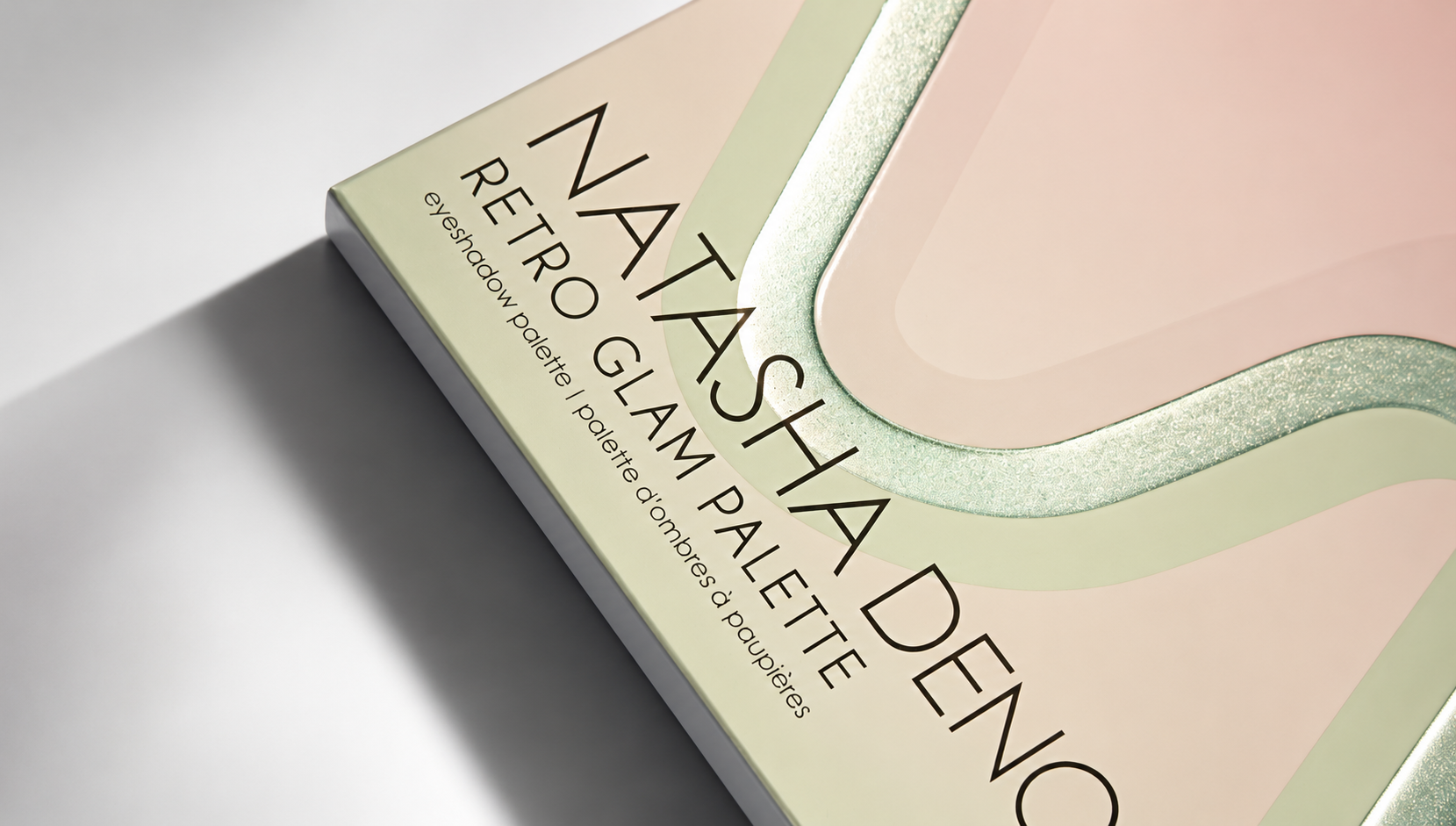


Soft to the touch, with tactile details, and striking in the way it catches the light. The packaging APG created for Natasha Denona builds its identity through contrasts.
The project did not originate from a single process but from the way print and embellishments interact on the surface: matte and gloss, colour and metallic reflections, softness and relief.
The board chosen for this box is 350g Algro Design, a virgin fibre board with an exceptionally high white point and excellent resistance to light and ageing. The reason for this choice lies in the design itself: the whiteness of the material allows lighter tones to retain their clarity and light, providing an ideal base for a print where chromatic precision is essential.
APG used five Pantone colours to build the colour palette for the Natasha Denona packaging. Colour, however, is just one of the layers of this project: the silver cold foil breaks the delicate background tones, with a lamination that follows the movement of the wave motif and reacts to light, emphasising some lines while leaving others more subtle. The design changes depending on how the light hits it, gaining depth and movement.
Light and touch continue to meet across the surface of the box: the gloss varnish enhances the design, while the matte soft-touch finish reveals an almost velvety softness. Lastly, the relief adds a tactile dimension to what the eye already perceives in the design.
In a composition dominated by delicate tones and reflections, the logo reads clearly, APG chose screen printing, a technique that provides greater opacity and build, reinforcing the logo’s presence on the surface.
It is in the balance between such different elements that the character of the packaging takes shape. The craft and skills stay in the background while the result takes centre stage: a surface that morphs, invites you to touch it, and reveals the precision with which it was made in every detail.
After all, luxury packaging is not about adding elements but about establishing how each one should come through, and that is exactly what APG does when it combines techniques, materials, and embellishments so that every detail finds its rightful place, turning the complexity of the production process into the strength of the design.
Read also: From the Track to the Collection: APG’s Packaging for Mongrip